 Hello Sweet Friends!
How are you today?
It is still raining here, as you can tell by my dark pictures.
Anyway, I thought I would do a little Copic Tutorial(ish) especially for those of you that are still very newish to using them.
There are a lot of AWESOME video tutorials on YouTube, just search for copics. And there are far better, more talented copic artists out there than me! ( so please go view them, and note what I am about to share are just my personal tastes and what works for me)
But, even after I direct people to YouTube and other places, I frequently get direct emails asking many of the same questions, so I thought I would go ahead and give my two cents/thoughts/tips. I have been using them for a couple of years and mostly learned by trial and error.
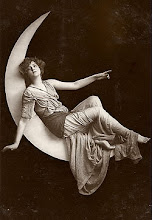
*Note: I purposefully did not blend well on this card, to show WHERE I place my shading colors. Hence the horrid lack of blending on the green laundry, her face, etc. (you can scroll down and find my Anya card, my Gorgjuss Girl/Oooh la la, etc. to see well blended coloring)
 Okey dokey...First, let's discuss the stamping. You will need a non-bleeding ink pad for the stamping. I use Memento Tuxedo Black. I have tried many ink pads, and this bleeds the least, IMHO. Still, be sure to let it dry VERY WELL before you start coloring.
Next, let's talk "starter colors", those markers you need when you are just starting out.
To a large degree this depends on what type of stamps you tend to color (* ie., people, flowers/landscapes, animals etc.).
I like to color anything and everything, so I have every Sketch marker, but I worked up to that. Even with owning every color, I still find myself using many of the same markers over and over. (I will list them below, but please read through this)
I use the brush tip more than 95% of the time.
For "people" (as shown here and elsewhere in my blog), you will need skin-tones and hair colors --these are markers I tend to use a LOT. Also, denim color markers for their pants. (I will make lists of numbers, dont worry)
For skin: Depending on whether she (or he...from here on out I will say 'she' meaning either gender) is tan (summertime people in bathing suits for example, or people of a darker skin tone), or if she is fair, will depend on which colors you will use.
My most frequently used skin tones (from light to dark) are:
EOOO (pale fruit pink); EOO (skin white); E02 (fruit pink) ...and for darker skin tones I like to add *E33 (sand) or *E34(Orientale)-- (*which I also use in brunette hair, shoes, and wood, and ground a lot!...E33 or E34 are well used markers for me...you only need one or the other, not both, since they are very close in number/color)-- for rosy cheeks I like R20 (blush)
I start with the lightest color and do the entire area. Then take your darker shade and do the "shading", where there would naturally be shadows (under the hairline, under the chin/neck, the folds of the arms and legs etc. (see girl above *hopefully you can click on the photos and see them up close/larger.) Then go back with the lighter shade (or middle shade if you use 3-4 colors, as I usually do. But this isnt neccessary...2 colors: a lighter and a darker is totally fine, and the best way to start) and blend the shading into the lighter area. You can keep going back over and over, darker and lighter, until you gt it just the way you like it. This is where practicing is crucial...and fun.
My most used colors for HAIR:
Brunette: E33 or e34 as my base, then E37 (sepia) , E09 (burnt sienna--especially for an auburn shade, also for auburn I like to add E08), and E47 (dark brown) (I have a dark brunette girl under titled post Oooh La la--one of my first posts)
Blondes/highlights (for highlighted blondes make it streakier/chunkier...my Anya in another post a couple weeks ago shows a streaky blonde): Y000 (pale lemon) as my base, then y21 (buttercup yellow) and E33 or E34 (yep, again, see this is a MUST HAVE color!)
Pitch black hair (and metals): (this can be the trickiest, so look for video tutorials on YT...and wait to get these markers unless you plan to color a lot of Asain hair, as they are really the only ones with BLACK hair--or if you plan to color a lot of wrought iron metal, or silver-ish stuff like galvanized metal looking watering cans etc. then these colors come in handy--an example of this is on my bird cage w/ veranda paper card below) (except you will want 110 Special Black, and the lightest grey, which I LOVE Co Cool Grey No. 0 --I use this to trace around my images as it makes them pop off the white CS, or for shadows) So, you will want the full range of greys, skipping every-ther number...I prefer the cools or nuetrals: start with the afore mentioned C0 or No, then the C or N 3, 5, 7 and then the Special Black. That will serve all your black hair needs and metals. But to start, just use the 0 and the black. Then later, add a middle, like a 3. Last, when you find you need them then add a 5 and 7.
Before I go into more colors I will also show you a tip I persoanlly love to do...it is awesome in person, and gets a big wow everytime. Stamp two images, and fully color your main image. Then figure out what layers you want to add for dimension, aka which parts are in front...and color them on the second image and cut them out. The foam tape them onto the first/main image. (see below and almost all my other cards using copics)
Here I cut out her arms and legs and the front of her slippers...and the knot/bow on her headband, and some laundry. Then I foam dotted them to the first image. In this case I used a bit of white tacky glue to press her hands back down to her face, so her forarms actually bend. It looks great IRL.

(You can also see below where I traced around her image with Cool Grey No. 0.)

Here is the list of OTHER basic markers I use frequently ( aside from what I already listed):
BLUES/ Denim/blue eyes/sky/water (I use the copic airbrush system) in order of my most used:
B21 (baby blue); B97 Night Blue; B000 pale porcelan blue ( also good for tracing around images for a more sky shadow); B12 ice blue; BG01 aqua blue; B69 Stratosphere Blue
Browns/Wood/nature/animal fur etc, the browns used for brunette hair is plenty...esp. E34! (or E33)
Pinks--Reds Most used, in order: R20 (blush); R83 Rose mist; R85 Rose Red; R39 Garnet; R46 Strong Red
Yellows-Oranges: If you have the yellows I use for the blonde hair, you have an awesome start and just need to add a couple of the darker brighter colors ( for flowers, suns, etc): y08 acid yellow; y17 golden yellow and yr07 cadmuim orange will be plenty to start.
(*remember you can mix colors, like a yellow and a red to get an orange)
Greens ( important if you do a lot of flowers/landscapes/nature/trees): You could get by (to start) with just these two of my most used greens ( a light and a dark, whihc you can mix):
YG11 Mignonette ; YG67 moss; ...then fill in with: YG Grass green; G28 Ocean Green( I've never seen an ocean anywhere near this color, but whatever)...then later fill in more w/ G09 and G24
Purples ( really only for flowers and clothes, if you like purple, which I do): start with:a light
BV00 mauve shadow or a BV02 prune; then a middle like V17 amethyst; and a dark like BV08 blue violet.
A couple of red-violets I use a lot are: RV19 red violet; RV69 Peony--great for roses, along witht he previouslyu mentioned pinks/reds.
A couple of other things: the only time I really use the chisel end ( aside from the airbrushing) is when I do the trace around shadowing....and MOST of all when I use the Colorless Blender-see below. (again, this is just what works for me...you may do differently. And I am always open to suggestions/your tips)
The Colorless Blender -0-: This is a misunderstood, perhaps even misnamed , but VERY USEFUL marker. (watch the vidoes!) You do need this, but not to blend. I use it most frequently to "fix" my boo-boo's, when I get color outside the line. I prefer to call it a Color PUSHER. I use the chisel end to 'push" the erroneous color back where it belongs. I also use it as a color remover...to add dots or texture to a color.
Okay, that's it for now. I'm a slow typer, so this wiped me out.
I hope it helped. And I am happy to answer any questions.
Colorful Inky Hugs,
Cheryl


This is wonderful Cheryl, I appreciate you taking the time to post all this information. I am just teaching myself to use Copics and always appreciate any hints I can find.
ReplyDeleteThank you Dawn, for the lovely comment. :o)
ReplyDeleteHave a wonderful time coloring and creating!
~Cheryl
Nice looking card Chery make it more attrective and cute thanks for sharing.
ReplyDeleteplastic card printing